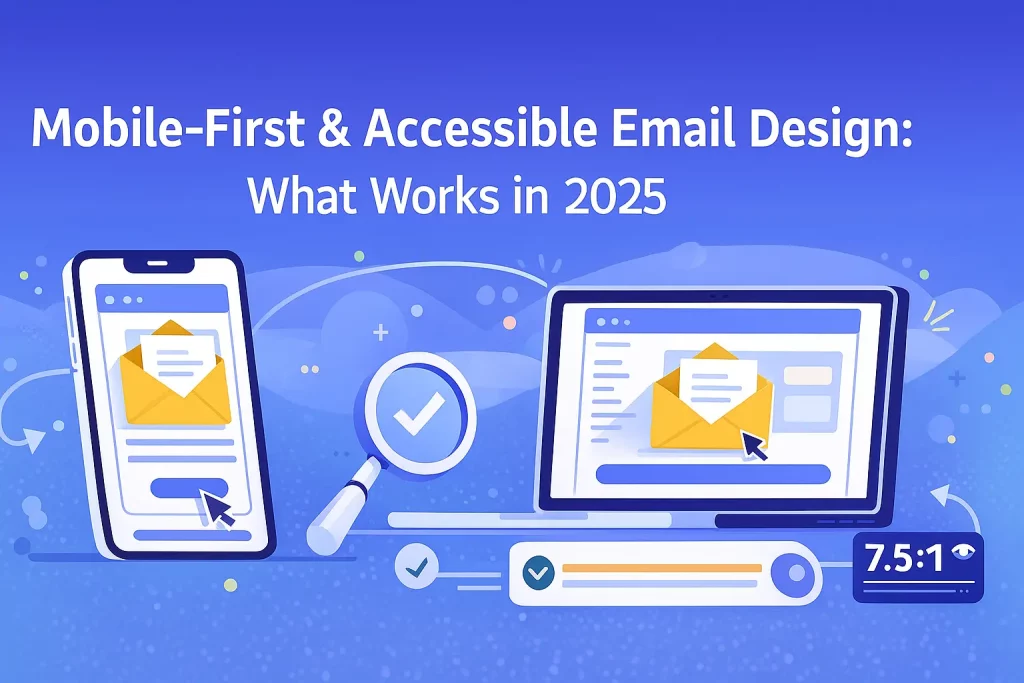
In 2025, more than 78% of email opens happen on mobile devices. That means mobile-friendly design is no longer optional — it’s the foundation of successful email marketing. Add to this the rising global emphasis on accessibility, and brands must ensure their emails are easy to read, navigate, and interact with for every subscriber.
Mobile-first and accessible email design helps improve engagement, boosts deliverability, and ensures your email campaigns comply with modern usability standards. This blog explores what truly works in 2025 and how you can implement these best practices using KVN Mail.
Why Mobile-First Email Design Matters Today
1. Most users read emails on mobile
Small screens, varying resolutions, and fast scrolling behaviour demand simplified layouts, clean content, and faster load times.
2. Accessibility boosts reach & engagement
Accessible emails ensure people with visual, cognitive, or mobility challenges can read and interact with your content — making your brand more inclusive.
3. Better mobile design = higher ROI
When emails are easier to read and navigate, users tap more, convert more, and stay subscribed longer.
What Mobile-First Email Design Looks Like in 2025
1. Single-Column Layouts Are the New Standard
Forget complex grids — in 2025, clean single-column layouts perform best on smartphones.
Benefits:
- Easier to read
- Fewer layout breakages
- Faster load times
KVN Mail’s drag-and-drop editor automatically adapts to mobile devices, helping you build clean, responsive designs effortlessly.
2. Large, Readable Typography
Text that’s too small creates friction and increases unsubscribes.
Recommended sizes for 2025:
- Headlines: 22–28 px
- Body text: Minimum 16 px
- Button text: 18 px bold
Choose font styles that remain readable and high-contrast across all devices.
3. Touch-Friendly Buttons & Links
Mobile users tap — they don’t click.
Best practices:
- Minimum button size: 44px height
- Plenty of padding around CTA buttons
- Use contrasting colours to highlight actions
A “Buy Now” or “Read More” button should always be easily tappable with a thumb.
4. Shorter Subject Lines & Preheaders
Mobile screens cut off text faster.
What works in 2025:
- Subject lines: 35 characters or less
- Preheader text: 40–80 characters
- Always keep your core message upfront
KVN Mail’s subject line optimizer helps test variations for the best performance.
5. Adaptive Images & Lightweight Graphics
Slow-loading emails kill conversions.
Mobile-first image rules:
- Use lightweight images below 200 KB
- Implement ALT text for accessibility
- Ensure images scale without distortion
- Avoid text-heavy graphics
KVN Mail automatically compresses and optimizes images for faster rendering.
What Accessible Email Design Means in 2025
1. ALT Text for Every Image
ALT text allows screen readers to describe images to visually impaired users.
Example:
Instead of: “Banner Image”
Use: “Special 20% discount on all digital marketing tools.”
2. High Contrast for Readability
Colour contrast must meet accessibility guidelines.
Good contrast example:
Dark blue text on a white background.
Avoid:
Light grey text on light backgrounds.
3. Logical Reading Structure
Screen readers read emails top-to-bottom.
Use:
- Clear headline hierarchy (H1 → H2 → H3)
- Short paragraphs
- Bullet points for clarity
KVN Mail templates follow best-practice structural formatting by default.
4. Don’t Rely on Images for Essential Information
Text-only users must still receive your message clearly.
Bad: Entire email content inside an image
Good: Text + image combination with ALT text
5. Accessible CTAs (Call-to-Action)
Buttons should:
- Have descriptive text (e.g., “Download Report”)
- Avoid vague labels like “Click Here”
- Use accessible colour contrast
Trends Shaping Mobile & Accessible Email Design in 2025
✔ Dark Mode Optimization
Most users now prefer dark mode. Ensure your emails look good on both light & dark backgrounds.
✔ Bold Minimalism
Clean layouts, fewer elements, and clear CTAs improve mobile readability.
✔ Micro-interactions
Subtle animations and interactive buttons enhance engagement without slowing load time.
✔ AI-Personalized Layouts
Email platforms like KVN Mail use analytics to optimize layouts for different user segments.
How KVN Mail Helps You Build Mobile-First, Accessible Emails
With KVN Mail, you get:
- Mobile-responsive templates
- Drag-and-drop blocks optimized for thumb navigation
- Clean code for better inbox compatibility
- Image optimization for faster loading
- Accessibility-friendly formatting
- AI-powered content suggestions
- Dark-mode tested templates
Whether you’re a beginner or a marketer managing high-volume campaigns, KVN Mail ensures your messages look perfect on every screen.
Conclusion
In 2025, mobile-first and accessible email design isn’t just a “nice to have” — it’s essential for engagement, conversions, and brand trust. When subscribers can read, navigate, and act on your emails effortlessly, your ROI naturally increases.
By adopting modern best practices and leveraging the advanced tools inside KVN Mail, you can build email campaigns that are beautiful, inclusive, and effective across every device and audience segment.